Widgets are the elements that can be added to the Designer canvas to create an interactive page. If you are designing for a touch-screen tablet, make sure buttons are big enough and text clear enough.
Button widgets offer these actions for a selected server, have default colours, and click-effects:
•Command to Play/Stop/Rewind (select)
•Load Show / Start Sequence / GoTo Marker / GoTo Frame / External Control (select)
Sequences, global variables, and markers are inserted into a show in DeltaGUI. Any play feature in a show then becomes available in Designer.
|
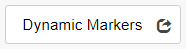
Show all markers in the current show as equally-sized blue buttons, or using an image (or on-click image-pair, as Image Button) for all markers. Properties apply to all markers in the show. The space you allocate to the Dynamic Markers object (under Position) will arrange buttons in rows, across, and the button size (under Visual) can be set to accommodate marker names. Too small an area will not hide any markers, but allow enough canvas space for the maximum number of markers in a show. Choose to show marker names (in white text), and whether to GoTo and Play. |
|
A blue button |
|
Shows pink in Design, transparent in use. Lay over a image or part of an image to create an active button. Ensure that the Area is in the top layer. |
|
A dark-grey button |
|
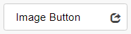
Add an action to an image, or an image pair for normal (image up) and click-on (image down). |
|
A light grey button |
|
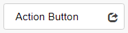
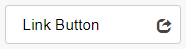
A blue button that can be assigned a URL (for example another Designer control page for another time, event or area) |
|
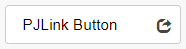
A blue button that can be assigned images as an image button, to operate projectors |
|
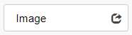
Add an image to the canvas, or if no images yet present, add a placeholder. |
|
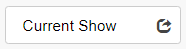
Display the file path and .xml name of the show currently loaded. |
|
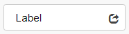
Add descriptive text to the canvas. |
|
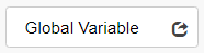
Global sequence variables are defined in DeltaGUI, and are available here. A variable might be used to show a real-time clock, display which timeline is active, set an audio level, etc. |
|
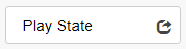
Display whether the current show is Ready to play, Playing or Stopped. |
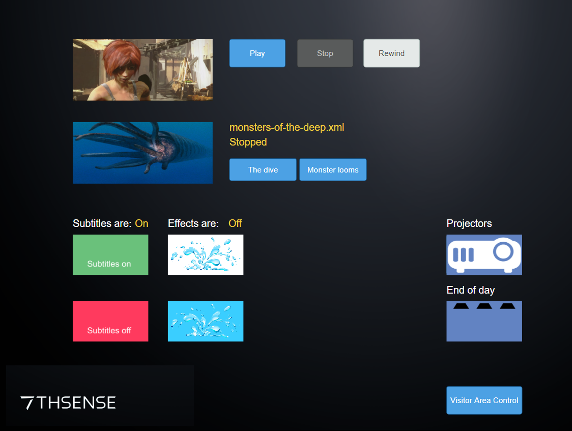
Here is an example of the different widgets. It includes a background graphic, images made active with overlaid Areas, plain buttons (play button icons are an alternative), Dynamic markers, buttons for sequences to switch subtitles and effects on and off, a PJLink and a Link button to a second control page for a different visitor area.

The finished browser page:
Page edited [d/m/y]: 07/04/2022